|
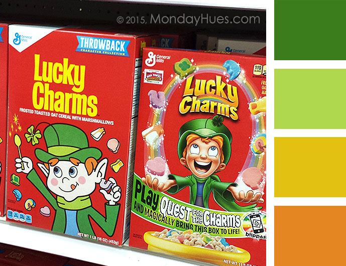
I am LOVING the retro cereal boxes by General Mills. I know they're totally marketing to my age group, and you know what? I don't mind one bit! I almost, almost, bought a box of Lucky Charms last week just because the retro design took me back to my grade school years at first glance. Good job, marketeers! You got my attention by bringing back cherished memories of the days when I had no cares in the world. My only worries were wondering what mom was going to make for dinner that night. Those were the days...
Which box design do you like best? I was roaming the Target aisles with my daughter when I first spotted the retro cereal boxes, and being the observant person that she is, she immediately noticed my excitement as I held these two boxes in my hands. "Which one do you like best?" she asked. Without hesitation, I told her I preferred the retro design. She disagreed and voted for the other. I do realize I am biased, but trust me, as a designer, there are definitely other factors influencing my preference.
So there you have it! Today's Monday Hues and graphic design tips were inspired by cereal boxes found and photographed by me, in the Target aisles. I'd also like to note that I picked today's inspiration source and color scheme in honor of St. Patricks Day, so enjoy your greens and golds and remember, inspiration is everywhere. Happy Monday! ~ Dio
0 Comments
Leave a Reply. |
Hi - I'm Dio!
Graphic Designer & Spanglish Lettering Artist Topics
All
My Shops*Affiliate LinksI am often asked what tools I use to create my work, so I’ve incorporated Amazon affiliate links in my posts to products I like, use and recommend. This means that if you click and make a purchase, I will earn a small commission paid for by Amazon, not the customer.
Please note that anything marked with an asterisk (*) indicates an affiliate link. Resources*List of products I use & trust:
E-Courses |
© 2018-2024 Copyright, Dioscelina Perez
42222 Rancho Las Palmas Drive #264, Rancho Mirage, CA 92270
42222 Rancho Las Palmas Drive #264, Rancho Mirage, CA 92270
Proudly powered by Weebly


