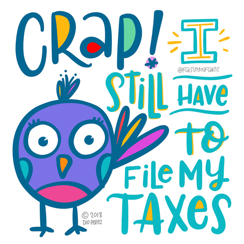
 I'm such a procrastinator when it comes to filing my taxes. Mostly because I'm a full-time employee with a side gig so at the end of the year I have a lot receipts to add up to enter all my deductions. I used to be HORRIBLE at keeping organized but along the years I've discovered ways to make the process a lot less painful, thanks to technology. If you're not a numbers person and are having a hard time like I did, here are a few tips to help you stay on track.
0 Comments
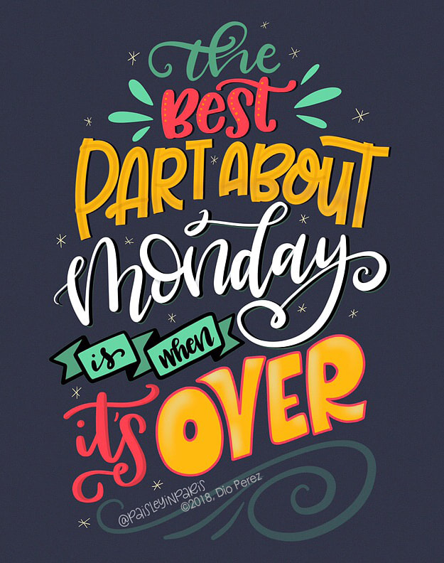
I never intended to jump on the "Monday hater" bandwagon. In fact, Mondays used to be my FAVORITE day of the week. I love where I live, I enjoy my commute to my office in Palm Desert where I spend all day doing what I do best – creating stuff! And marketing stuff - ha!
However, the last two seasons at work have been very intense and without proper rest time for almost 2 years, I'm feeling pretty burnt out. Waking up to an alarm clock on a Monday morning is not necessarily my favorite part of the work week. But you know what's my favorite part about Monday? When it's over, 'cause Friday, here I come!
NOTE: Artwork created on the iPad Pro in the Procreate App with the Apple Pencil.
 It all started last Saturday morning. I woke up with a sore throat, but I thought it was just allergies combined with a minor cold I may have caught the night before at the Hombres G and Enanitos Verdes concert. But I was wrong.
I'm a freakin' rollercoaster of chills and sweat, hot and cold, sneezing and congestion to suddenly breathing and feeling a tad bit more normal for a short period of time. I feel better one moment, but then I get up to warm up so soup for myself aaaand then I'm exhausted. It's already Thursday morning and I have a feeling that these germs love me so much, they're gonna stick around for Weekend 2. Yay me. Stay healthy my friend. Achoo! Xo, Dio ;-) 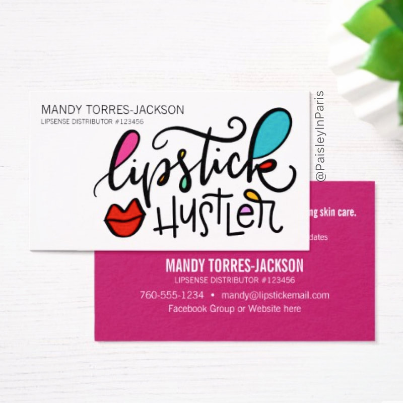 This one's for you, my fellow lipstick hustler! Showcase your love for color with these attention grabbing business cards. They're bright, fun and colorful just like your LipSense products AND they deliver a clear message at first glance. When it comes to makeup, you're their girl!
To purchase visit my Zazzle shop at PaisleyInParis.com 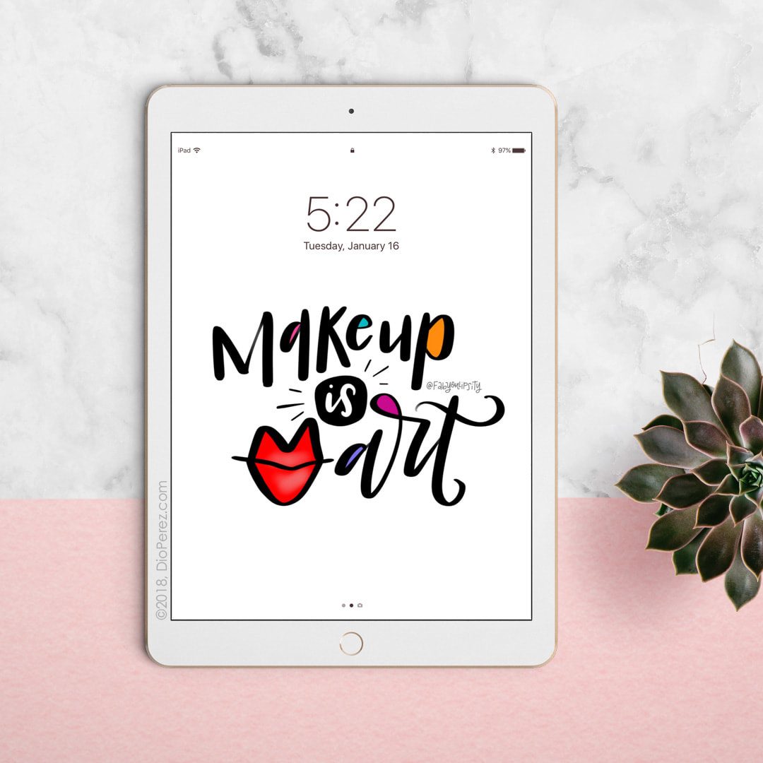 This one's for all you makeup lovers! Digital wallpaper for your phone and iPad, now available in the shop. If you see something on my Instagram feed that you like and would like to have it as digital wallpaper for your devices, send me a note! I'd be happy to set that up for you.
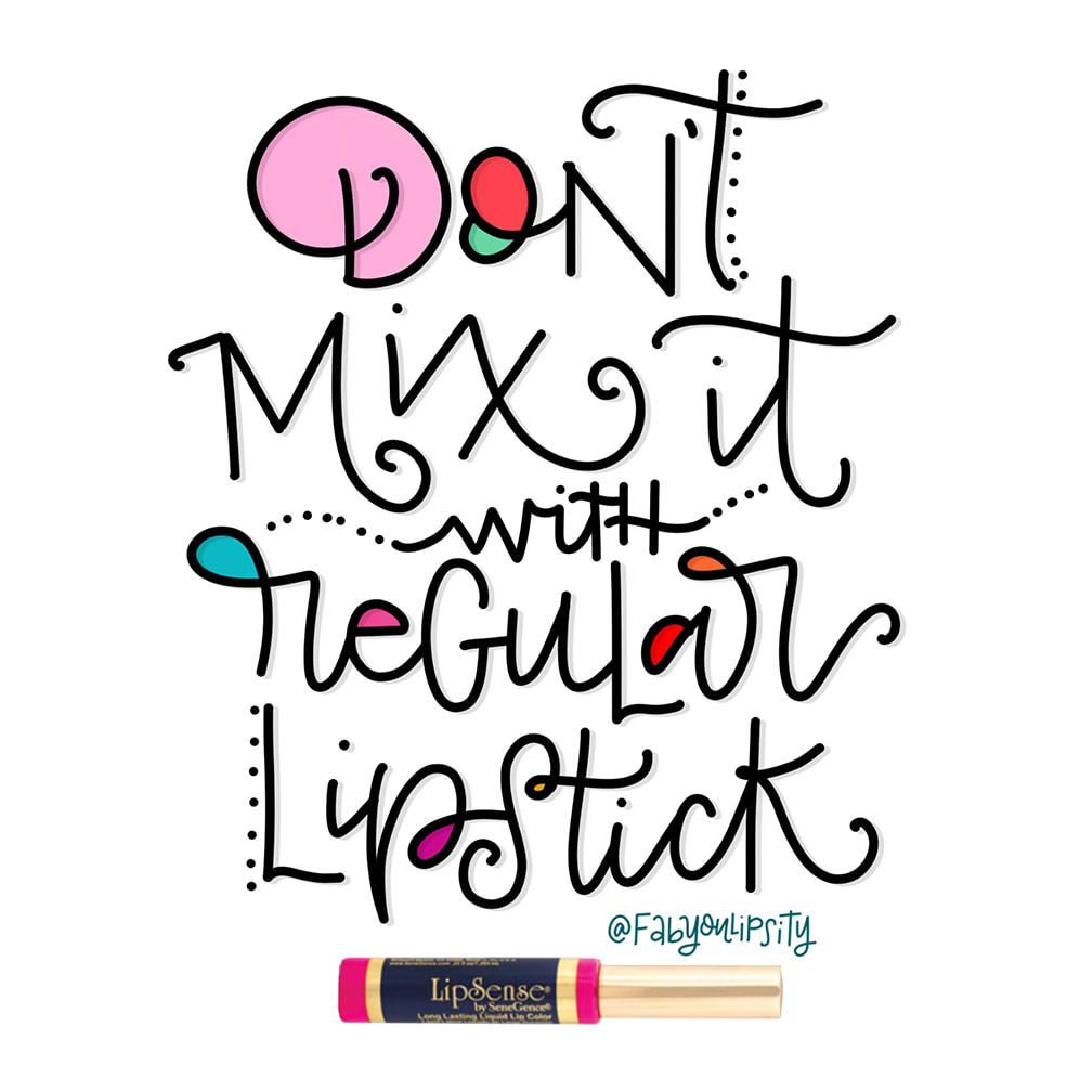 ✍😃 Just a reminder to those who are new to LipSense. Please don’t layer it with regular lipstick and other gloss brands or you may end up with a patchy lip color that smears - ew! The LipSense color and gloss formulas were created to work with each other.
The smudge-proof color binds to your lips and the shea-based LipSense gloss permeates the color to moisturize your lips while locking-in the color. Chapstick, lip balm and regular lipstick will breakdown the long-lasting formula of LipSense, and trust me, that’s no fun. ~ Now cheers (with coffee) to a very happy hump day! ☕️😁 If you have any questions, send me an email! I'm always happy to help.
It was the fall of 2013 when I signed up to take an online course called Make Art That Sells (MATS). I paid BIG bucks for it because I have always wanted to be a licensed artist and I had no idea how to get there.
At the time my online shop at PaisleyInParis.com was bringing in a steady stream of income so I felt confident in my ability to create, well, art that sells. But $600 and several art assignments later, I realized that both myself and my artwork were just a “baby” compared to the quality of work other MATS students were producing. At that point, I started questioning my own process and comparing myself to others...
It was through MATS that I saw the true difference between practice work and professional quality illustration work. It was also through MATS that I discovered the art of hand lettering and it’s funny how that happened because it was only mentioned as part of an assignment where Lilla assigned us to create an illustrated map of where we live. She encouraged us to include our own lettering on it because if it ever became a piece we wanted to sell, we wouldn’t be violating any font copyright laws. I did as she suggested, tried incorporating my own letters and boy did I struggle with it. It was honestly, the hardest part of my assignment — and I only lettered five words total! “How do people do this — BY HAND???” I asked myself, as I began to truly appreciate the art of font making. 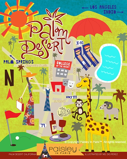
This is how my map assignment turned out.
I drew everything by hand, including the lettering for "Palm Desert" and "The Living Desert." It was too difficult for me at the time, so I used fonts for the city names and highways. This my friends, was the beginning of my lettering journey.
A few weeks later the course ended and I was left with:
I forgot about lettering until the spring of 2015 when I came across a few lettering accounts on in Instagram and I’ve stuck with it ever since. Despite the cringe-worthy letters I was creating at the time, I found that the more I did it, the more I fell in love with this craft. As a pen collector (oh, who am I kidding...let’s call it what it really is - I’m a pen hoarder!) I was so excited to finally put all my pretty pens and markers to use. I also found the portability of this craft to be utterly convenient, making the long waits at the doctor’s office and jury duty much more enjoyable. There’s TONS of reasons why I fell in love with hand lettering and I’m sure I’ll have the chance to elaborate on each and every single one of them as I continue to write this newsletter through the coming years. But for now, I want to leave you with the following thoughts: If you’re feeling a bit stuck or discouraged in your lettering journey at this time and you’re asking yourself the same questions I asked myself 3.5 years ago (regarding illustration), here’s what I can tell you…
One more thing.
If you’ve invested time and money in taking hand lettering courses and buying the trendiest lettering tools that alone won’t make you a better lettering artist just like buying a salad won’t make you skinny. It’s the changing of habits that makes a difference. Just like changing your habits to nourish and exercise your body daily will have a physical impact in the way you look, creating the habit of practicing your hand lettering for 15 minutes a day will have an impact in the way your letters look. And if you’re thinking “maybe lettering isn’t for me,” I don’t mean to sound discouraging but honestly, if you don’t love the process of creating more than you love the outcome, then perhaps lettering simply served a different purpose in your life. Perhaps it has or it will lead you to discover new friendships or a totally different interest, like MATS did for me. And that's okay because in life, everything we do is a stepping stone to the next experience in our journey.
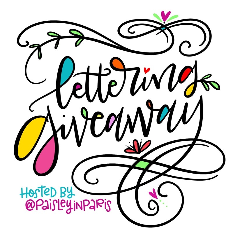
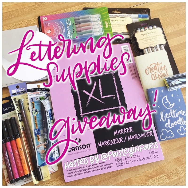
Before I go, I want to let you know of an awesome lettering supplies giveaway I am hosting on Instagram. If you haven't heard about it, head on over to my Instagram feed to get all the deets. Deadline to enter is this Friday, April 28th at 11:59pm Pacific Time.
As always, I encourage you to send me a quick note with any of your lettering questions. I'll be happy to answer them by email or newsletter, because I'm sure others will have similar, if not the same, questions as well.
If you made it this far, please give yourself a pat on the back. Thanks for hanging out with me today. I truly value and appreciate your time. All the best, you lettering coach, Dio =]
Ready to explore and perfect the way you draw your letter M? Join me during the month of March with this lettering/doodle challenge as we tackle words that begin with "M".
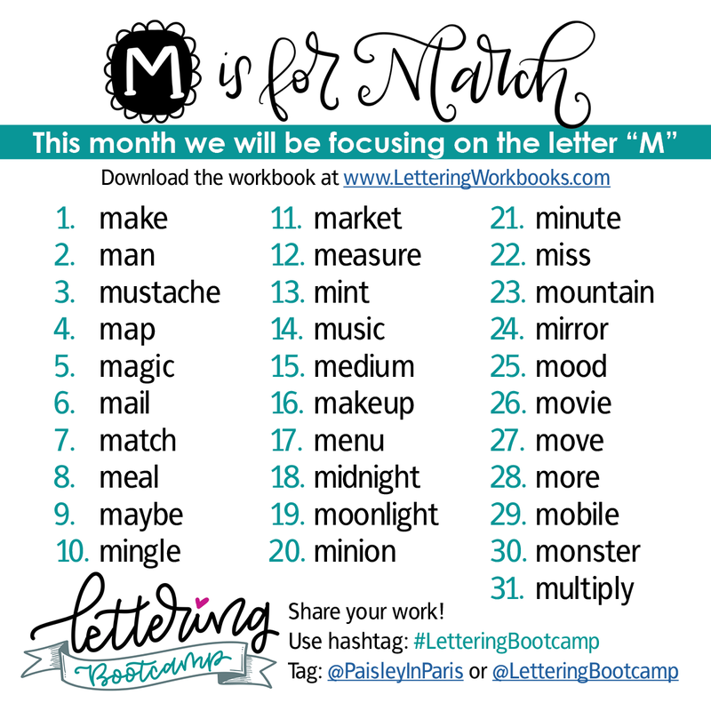
Take it a step further and download the workbook which contains inspiration and instructions to help you push through your comfort zone and get those letters into tip-top shape. Click below to take a peek inside...
Can't wait to see all your "Magnificent" work! Please note that I will be posting my drills @PaisleyInParis, which will allow the @LetteringBootcamp feed to be your "go-to" place for the latest Lettering Bootcamp challenges.
Lettering Tips and Inspiration
Join the Lettering Bootcamp mailing list to receive lettering tips and design inspiration directly to your inbox.
When designing stationery, every element, from font options to paper selection can greatly affect the final product. This is why I'm sharing with you today my latest find and my new favorite stock for digital printing.
The name of the stock is: Mohawk Superfine Eggshell i-Tone Ultrawhite, 270 GSM It's an uncoated stock with the perfect shade of white and a slight texture that adds a touch of sophistication to your projects. Give it a try when you have a chance - I'm sure you'll be very pleased with the results. Card Stock Recommendation from dioperez on Vimeo.
Stationery Design Tips & Inspiration
Join the Stationery Bootcamp mailing list to receive lettering tips and design inspiration directly to your inbox. 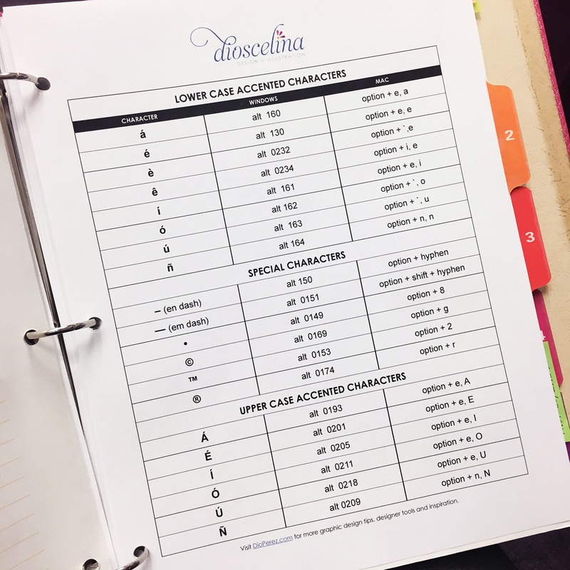 Hi there! I'm super excited to share my latest designer cheat sheet with you. I'm sure you'll find it super handy, especially if you're like me where you jump between Windows and Mac platforms all the time. You see, I'm a PC-based graphic designer at my 9-5, but I only have Mac electronics at home, so yes, I tend to go a little nuts from time to time trying to remember the keyboard commands. Save yourself some time and avoid embarrassment My advice to you, no matter what platform you use, memorize these! You'll save so much time 'cause you won't have to stop what you're doing to search the web or look for your cheat sheet. I learned the keyboard commands for lower case accents about 20 years ago and all was smooth sailing until a couple of years ago when I switched to Mac at home. One more thing! NEVER think that it's okay to substitute the letter "ñ" with a regular letter "n" just because you don't remember how to add that little squiggly line at the top. If you do, you'll end up totally changing the meaning of a word or even a sentence, for that matter. For example, you know when we say "Happy New Year" in English? Well, that is translated as "Feliz año nuevo" but if you use just a regular "n" so it says "ano" – that spells a bad word! Well, not really a bad word BUT "ano" is that place you wipe every day after you go number two. And you do really want to be the person who writes "Happy New Anus" on a design project just 'cause you were too lazy to learn your keyboard character commands? I hope not! Well, it looks like you got yourself a free printable cheat sheet AND a Spanish lesson today. Yay, you! Heehee. Just enter your email below to have the cheat sheet sent to you automatically. Print it out and keep it in a binder or keep it on your bulletin board where you can see the codes at a at glance. Cheers to reference sheets that make our jobs easier. Happy designing, my friend. =] |
Hi - I'm Dio!
Graphic Designer & Spanglish Lettering Artist Topics
All
My Shops
*Affiliate LinksI am often asked what tools I use to create my work, so I’ve incorporated Amazon affiliate links in my posts to products I like, use and recommend. This means that if you click and make a purchase, I will earn a small commission paid for by Amazon, not the customer.
Please note that anything marked with an asterisk (*) indicates an affiliate link. Resources*List of products I use & trust:
 

E-Courses
|

© 2018-2024 Copyright, Dioscelina Perez
42222 Rancho Las Palmas Drive #264, Rancho Mirage, CA 92270
42222 Rancho Las Palmas Drive #264, Rancho Mirage, CA 92270
Proudly powered by Weebly