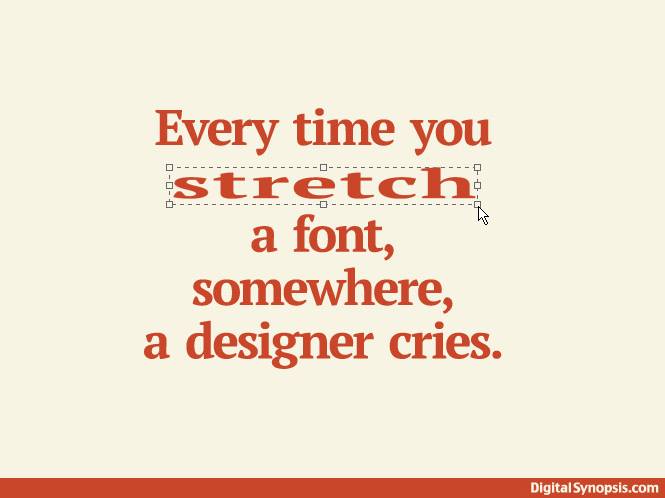
I came across this funny graphic today by Digital Synopsis, it make me chuckle because I can totally relate! When I see fonts that are stretched out beyond recognition for now apparent reason, I get so irritated that I'm pretty sure it messes with my blood pressure.
So here's a the tip for the day, and I'm not sharing this for the same of my personal health, for the sake of your graphic design portfolio. Don’t EVER stretch out your fonts to the point they are unrecognizable. It’s like shaving your eyebrows and drawing them in arched halfway up your forehead. You just don’t do it. 
Join the mailing list for more design tips sent directly to your inbox!
0 Comments
Leave a Reply. |
Hi - I'm Dio!
Graphic Designer & Spanglish Lettering Artist Topics
All
My Shops
*Affiliate LinksI am often asked what tools I use to create my work, so I’ve incorporated Amazon affiliate links in my posts to products I like, use and recommend. This means that if you click and make a purchase, I will earn a small commission paid for by Amazon, not the customer.
Please note that anything marked with an asterisk (*) indicates an affiliate link. Resources*List of products I use & trust:


E-Courses

|

© 2018-2024 Copyright, Dioscelina Perez
42222 Rancho Las Palmas Drive #264, Rancho Mirage, CA 92270
42222 Rancho Las Palmas Drive #264, Rancho Mirage, CA 92270
Proudly powered by Weebly